Bronman’s
Ingredient callouts and a four-step application guide explain the beard butter beyond the pack shot. Wood textures and western-style type carry through the listing and A+ content.
Listing images · A+ Premium
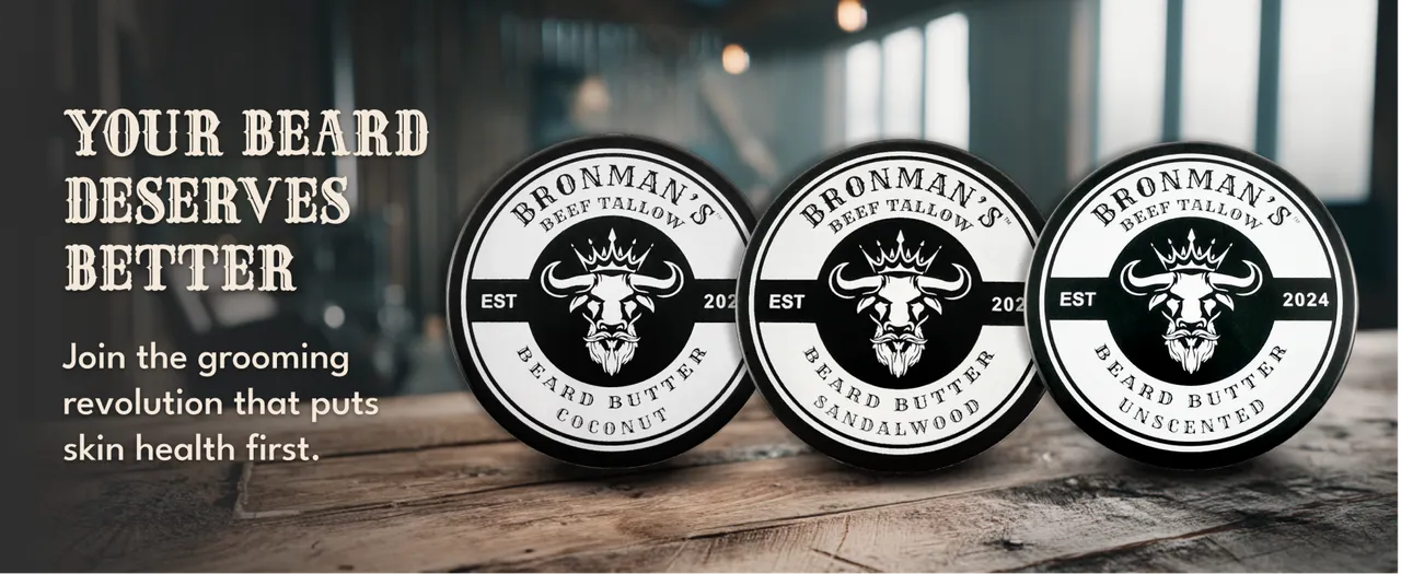 Full size: Three Bronman’s beard-butter tins on a wooden surface. (opens in a new tab)
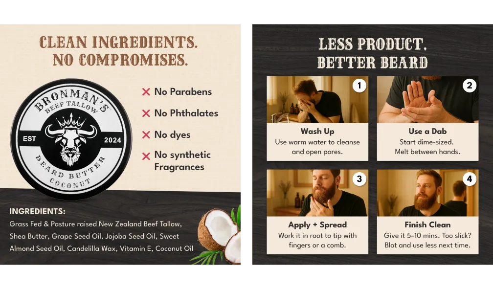 Full size: Bronman’s beard-butter ingredient panel and four-step application guide. (opens in a new tab)
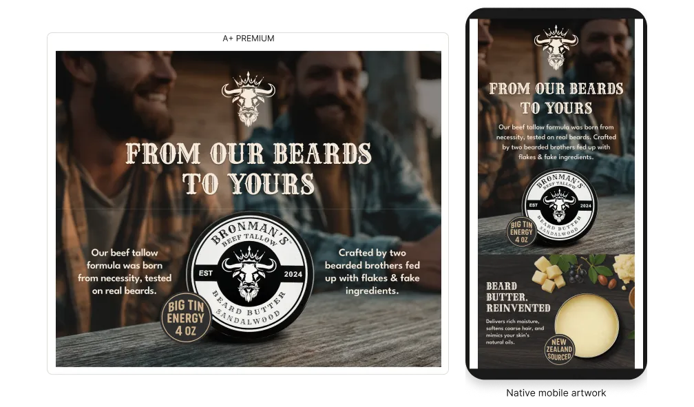 Full size: Bronman’s brand-origin A+ Premium desktop artwork and native mobile layout. (opens in a new tab)